


Under the title “beisteuern” (“contribute”), in January 2017 an art concept for the first stage of construction of the Steuercampus in Munich was proposed on the occasion of an art-for-architecture competition. The Steuercampus in Munich is intended to accommodate on one site the administration of Germany’s biggest tax office, in several stages of construction. The concept envisages a comprehensive design solution for the exterior and interior, for which the total of 360 offices in the building are to be given an individual appearance.
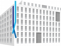
of the concept
to the external
façade
17-03-001
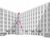
of the concept
in the courtyard
17-03-002
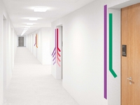
of the concept
in the office
corridors
17-03-003
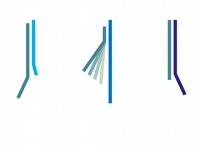
individual designs
on the
360 office doors
17-03-004
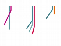
individual designs
on the
360 office doors
17-03-005
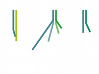
individual designs
on the
360 office doors
17-03-006
The life of the community depends on the contributions of the individual. The roots and stem of a plant are the symbol of this fiscal symbiosis. The roots provide nutrients for the whole plant. And they anchor the whole plant. This commonality is here represented in a degree of abstraction that excludes close-to-nature appearances. Only the principle is to be visible.
The concept:
Root and stem is the visual guiding principle of the “beisteuern” art concept. Not natural images but ideal images are derived from this. The idea of the community, the idea of confluence, the idea of the upward direction, and above all the idea of infinite variety, are the contents of the concept. They are made visible through visual forms, in images that express various notions: multi-part, concentrated, consistent and upright, sharing a direction and purposeful. The multiple images have all of this in common and thus join to form a single large image.
The effect:
Tax administration is not dry bureaucracy but an organism that lives by the principle of contributing. For the public this message is visible on the outer façade, for employees also on the façade of the courtyard and on all floors of the building. Visual elements on the door lend individuality to the offices. Thus employees identify with their place of work. The function and significance of the individual are emphasised. From being a grid of offices, the building becomes a sphere of life.
The implementation:
Thin, powder-coated sheets of light metal are attached to the façade at a distance of a few centimetres from the wall. The image elements on the different floors are painted onto the exposed concrete with acrylic paint and covered with a protective layer. On each floor there is a basic colour for the whole floor and additional colours that appear once each. The form also appears only once on each floor. All elements are arranged around a vertical axis. This axis is always located at a corner of the structure. In this way the art is physically integrated into the architecture.


